


3
Alto Spaces

4
Make Stuff 2024
3
Fedrigoni 366 (2024)

6
Chez Baker

3
The Nature of Urban Nurture

7
Shift Click

4
Pyre

5
Digital service branding
3
How You Say

3
Red Shed 2020

1
Creative Floor 2019

2
MadLab Venue 17/18

2
PatternCraft

2
Make Stuff
7
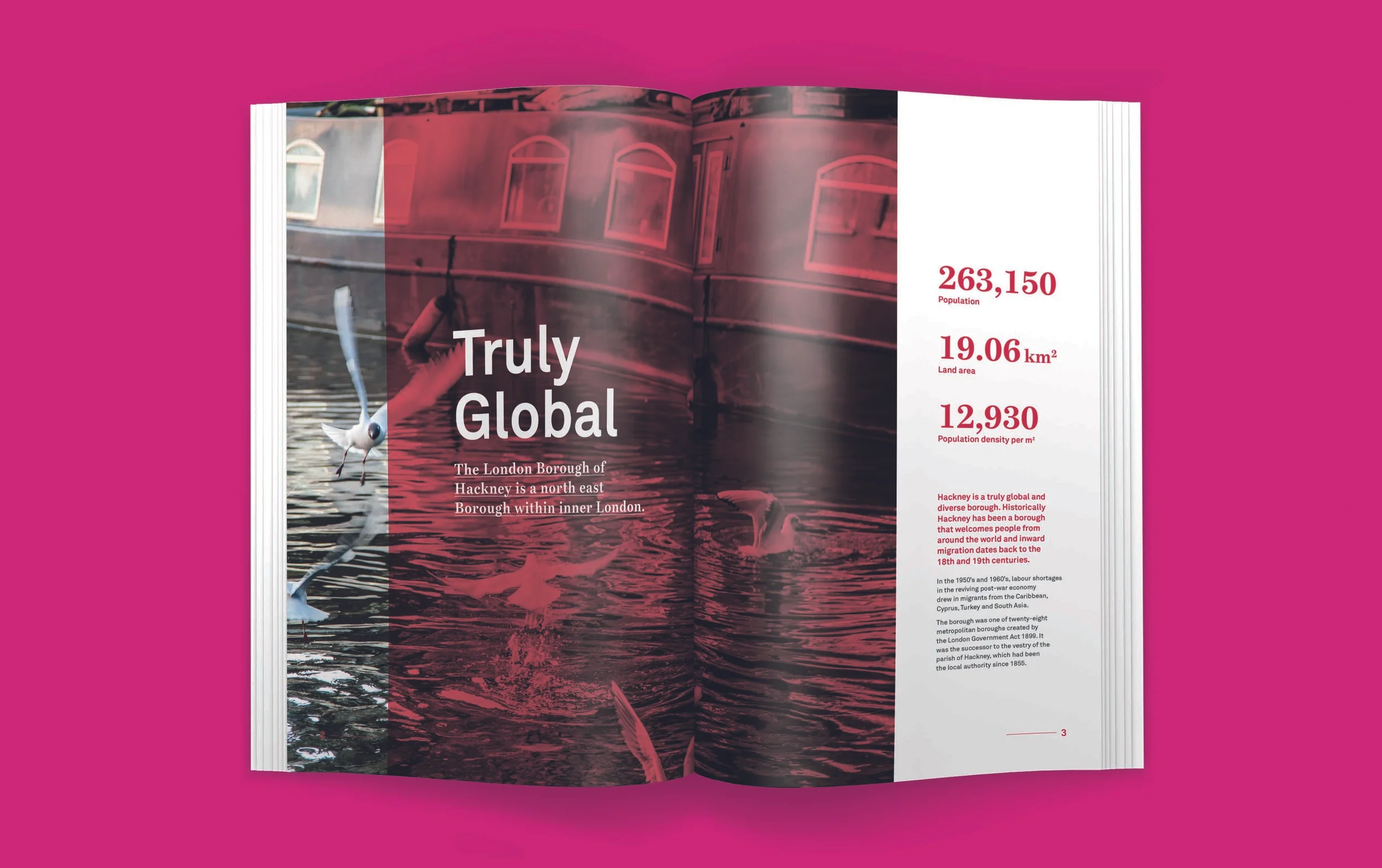
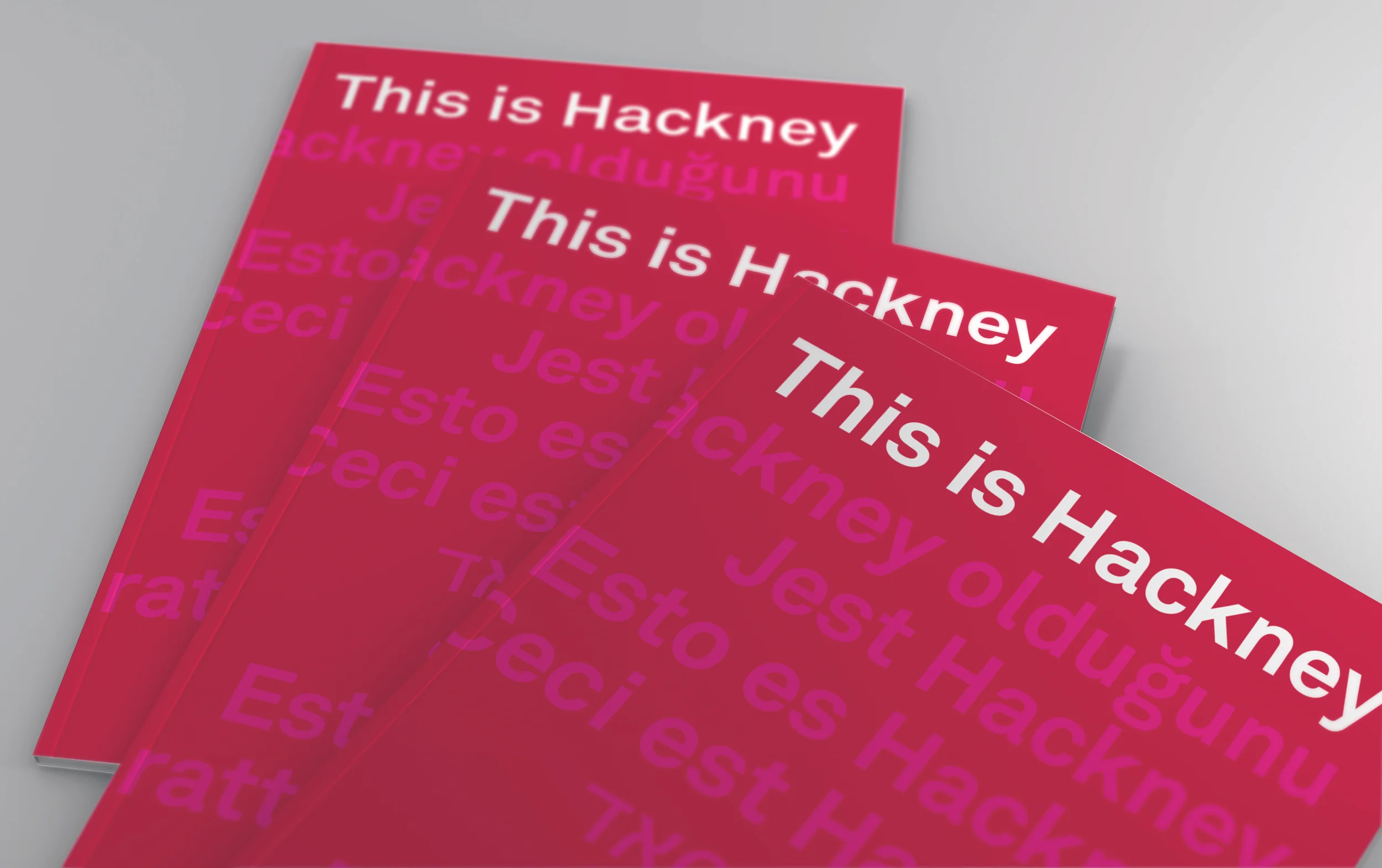
This is Hackney

10
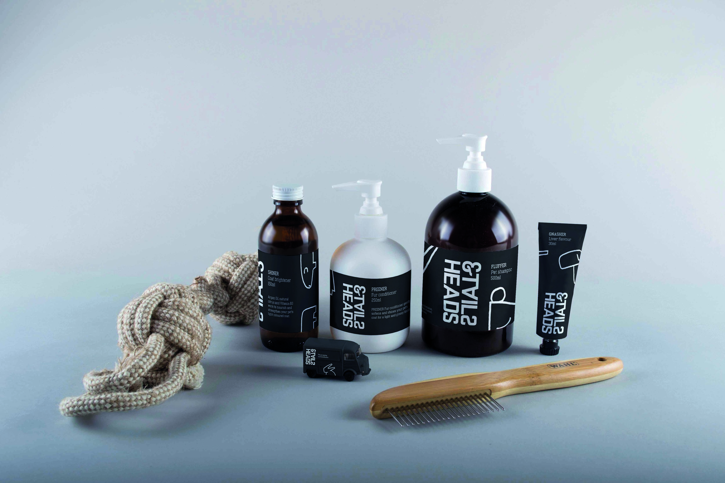
Heads and Tails

6
George Kaplan

5
Bracket
4
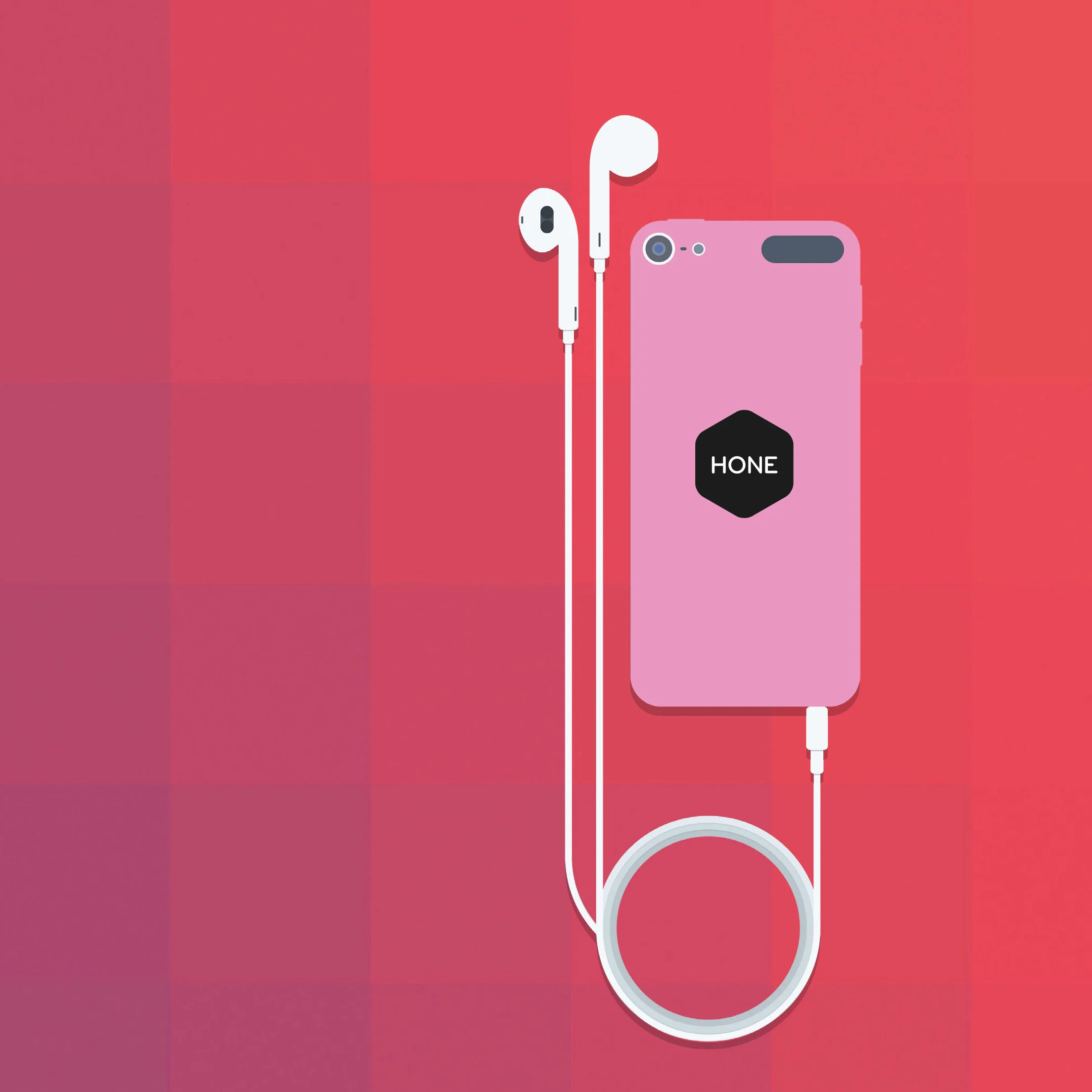
Hone

4
Collected Calls